Tables and charts from Widgets
Putting a table and a chart on the page, changing their look and their data
The Widgets panel holds ready-made components: tables, charts and the photo grid. You put two of them on the page, change their look in their panel and their data in the data panel, as in a spreadsheet.
1 · A table
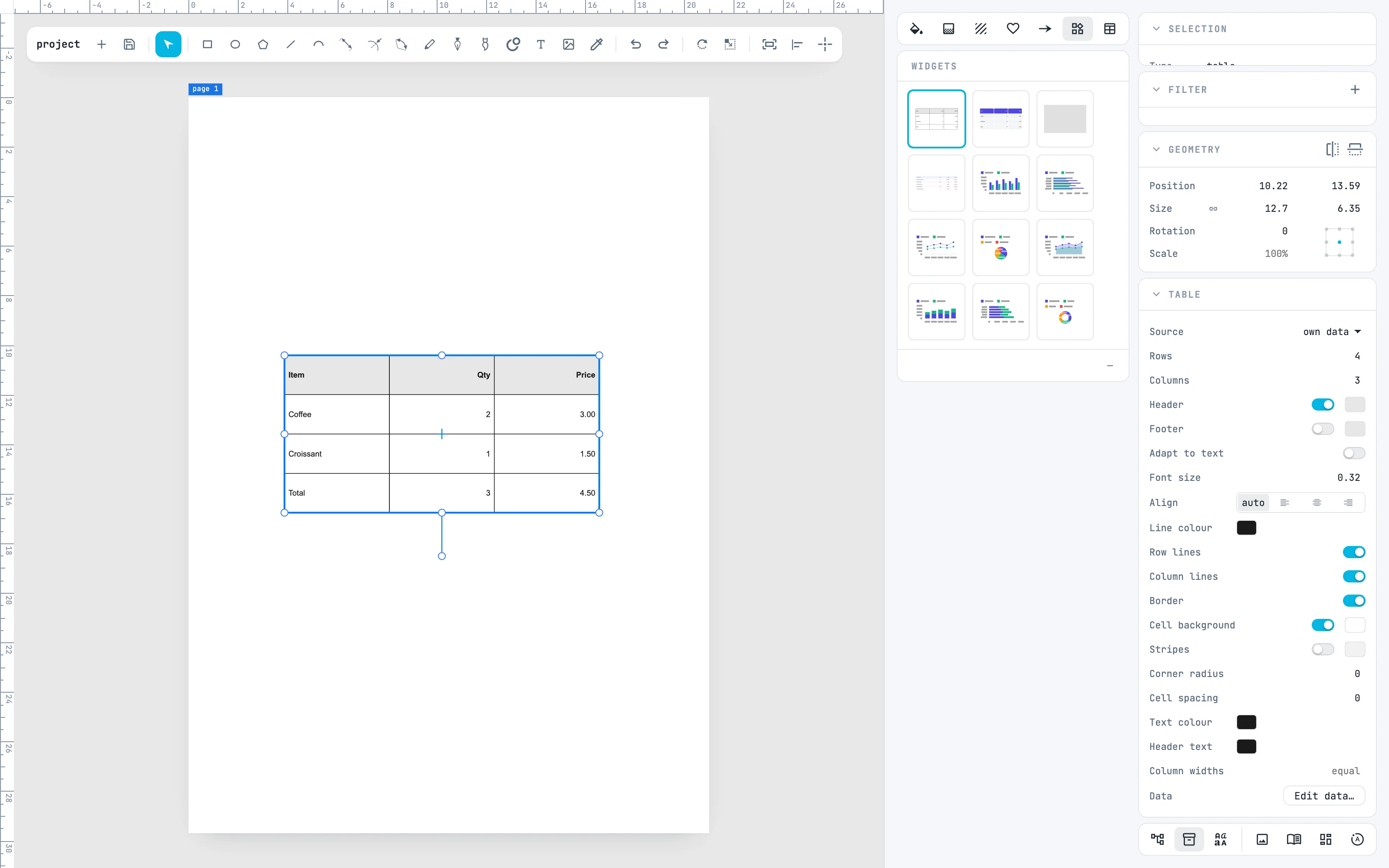
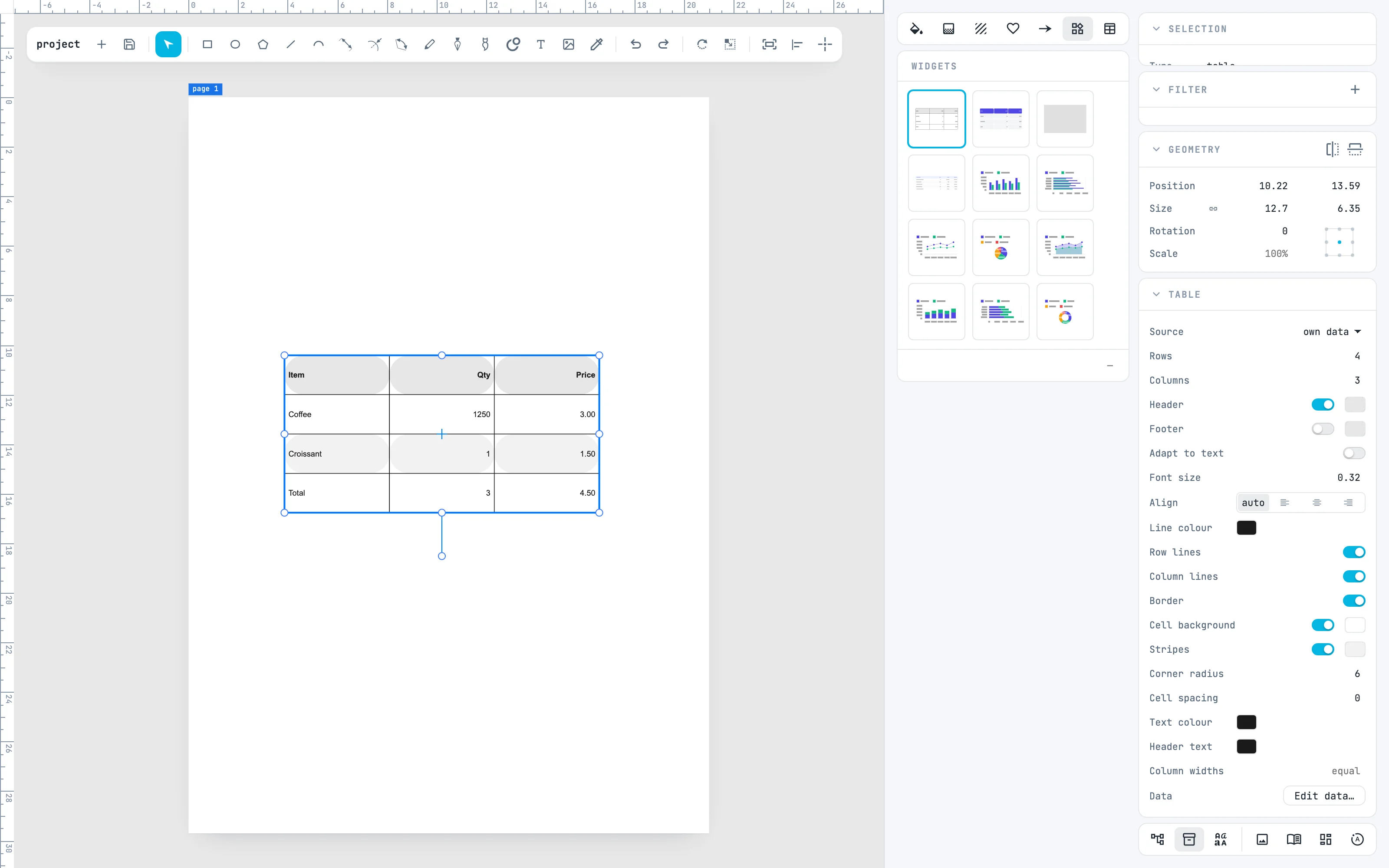
In the Resources column turn on the Widgets panel with its button at the top of the column. Double-click Table: the table is created in the center of the view, with sample data, and is measured in the document's units. Dragging a cell instead creates it where you drop it.
2 · The look
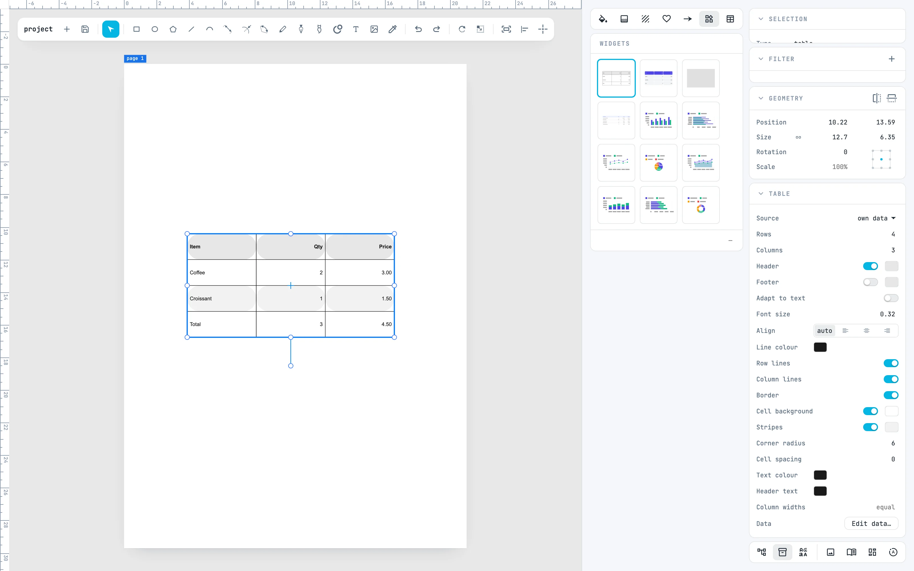
In the Table panel: Header and Footer make the first and last rows the header and the footer, Row lines, Column lines and Border turn on the lines, Stripes the alternating rows, Corner radius rounds the cells, Column widths gives the proportions of the columns. Here Stripes on and Corner radius 6.
3 · The data
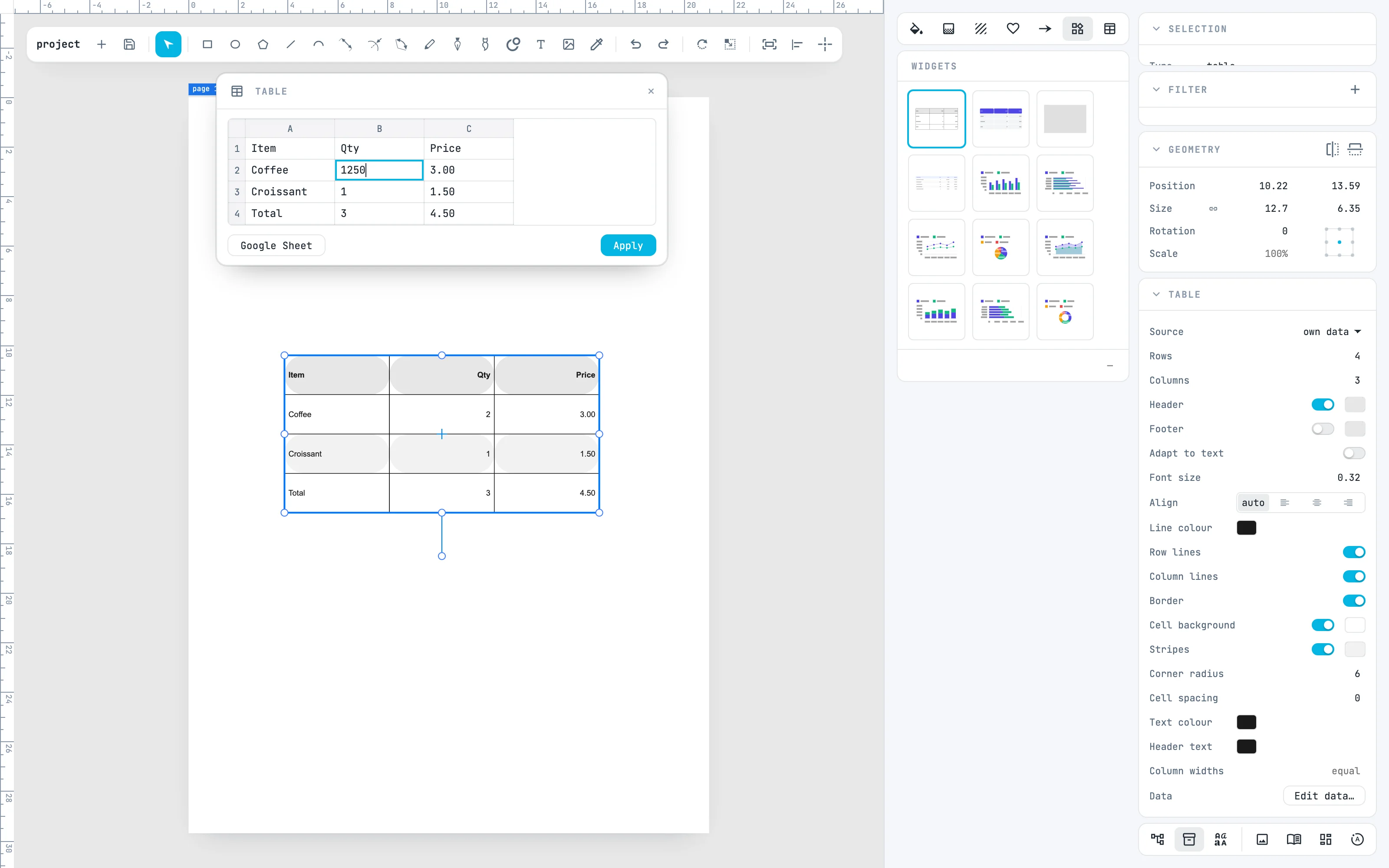
Double-click the table, or Edit data… in the panel: the data panel opens, with lettered columns and numbered rows. A click on a cell writes in it; Tab goes to the next cell, Enter to the one below. Here the coffee quantity becomes 1250.
4 · Apply
Apply writes the data into the table, in one step, and closes the panel. Before Apply, ⌘ Z undoes in the panel. The Google Sheet button reads the data from a Google sheet instead.
5 · A chart
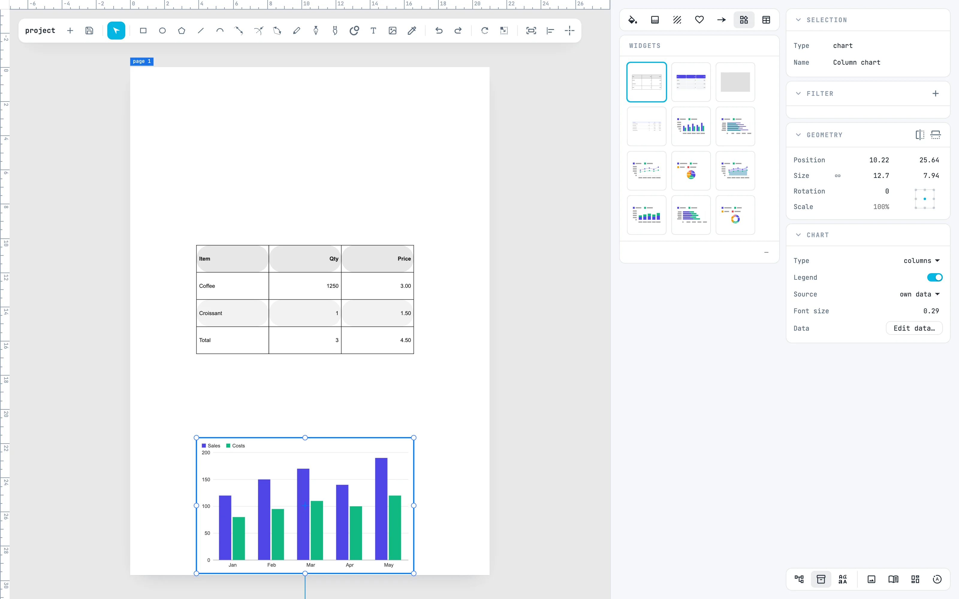
Drag Column chart from the panel onto the page: it is created where you drop it, with the Chart panel. The data reads as in a spreadsheet: the first row holds the series names, the first column the categories, the others the values. Source can take them from a table in Tables.
6 · Make it a pie
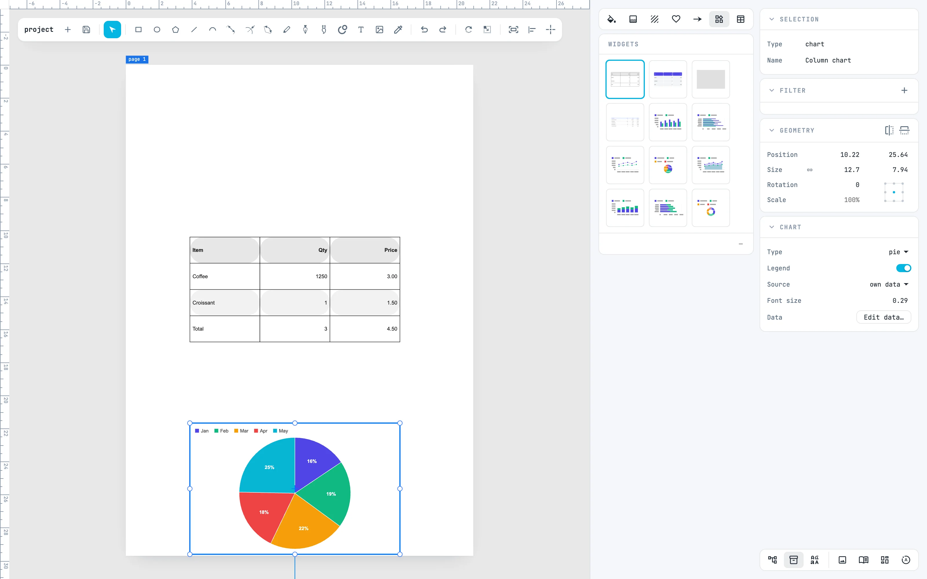
In the Chart panel, Type changes the drawing: columns, bars, lines, areas, stacked columns and bars, pie, donut. Here pie with Legend: pie and donut draw the first series, and the legend names the slices.
Going further
In the guide: Widgets, tables and charts, the data panel and data tables.